Portrait vs. Landscape: How to Choose Which Orientation to Use
The photo orientation you use depends on your destination platform, the visual makeup of your subject, and the type of content you’re creating.
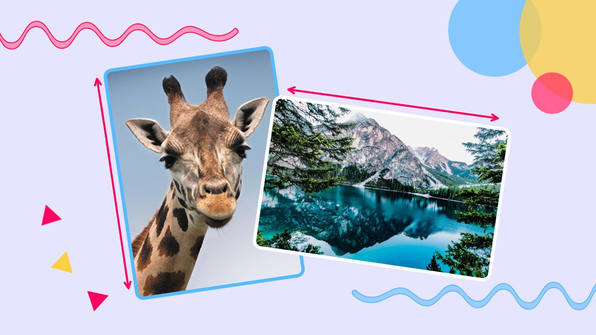
If you’ve ever printed a picture, posted on Instagram, or gotten family pictures, you’re probably familiar with the terms “portrait” and “landscape,” referring to photo or video orientation.
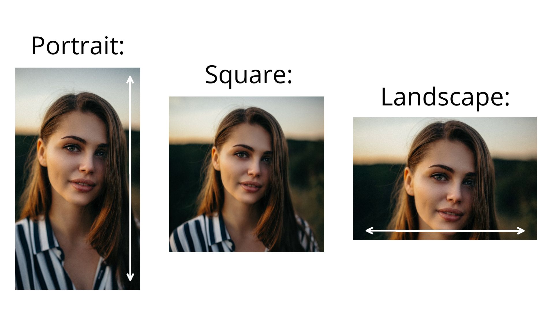
Basically, the Portrait orientation is used to describe any aspect ratio taller than a square, in which the width of a photo, video, or document is shorter than its height. Landscape orientation, on the other hand, describes anything wider than a square, where the width is greater than the height. Whether you use one or the other depends on many different factors, such as destination platform, the visual makeup of your subject, and the type of content you’re creating. Let’s get started!
- Common Portrait and Landscape aspect ratios
- Posting on different platforms
- Showing what you need
- Using different types of content
1. Common Portrait and Landscape Aspect Ratios
Whether you’re working with a portrait or landscape layout, it’s important to know the most common dimensions for different types of image and video in both orientations. I’ll go over the main ones:
Portrait:
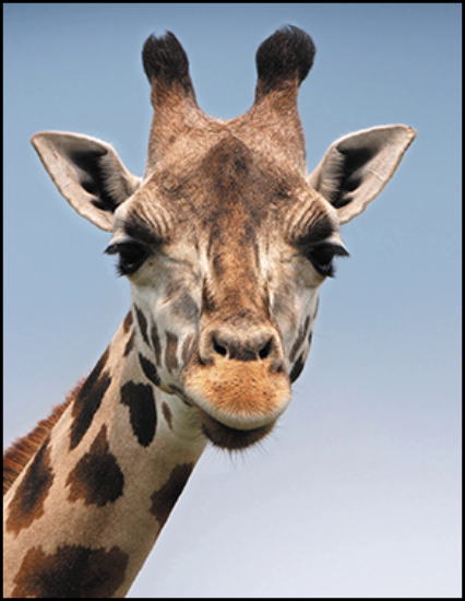
8.5:11 – You probably recognize this as the aspect ratio of printer paper, which is why it’s the most common aspect ratio for documents in a portrait orientation, as well as homemade posters and flyers.

9:16 – If I were to predict the most important aspect ratio of the 2020’s, I would choose 9:16, without question. Dominant social media platforms like TikTok are built around 9:16 video, nearly all phone cameras record video in 9:16, and even legacy platforms and editing programs are expanding their restrictions to support the mobile default for vertical video.

2:3 – This is the typical aspect for photo portraiture. It’s just the inverse of the typical landscape aspect ratio for photography, so it’s not too surprising that you’ll find this aspect ratio in anything from wedding shoots to firework photographs.

4:5 – Most photographers shoot in 2:3 when taking photos with a portrait orientation, but it’s common for these photos to be cropped at the top and bottom for prints. These tend to use a 4:5 aspect ratio, just a bit shorter than the original 2:3.
Landscape:
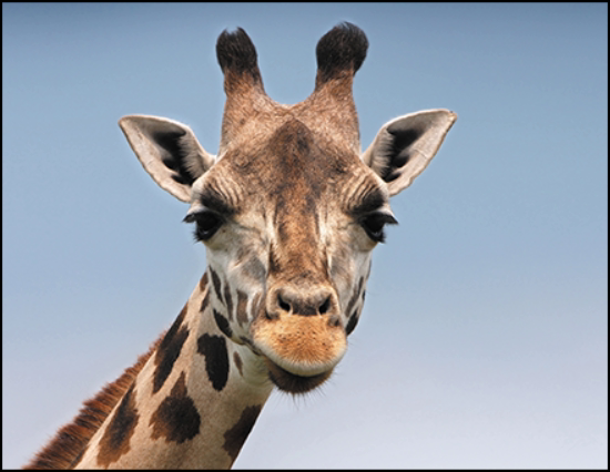
11:8.5 – As you might have expected, many of the most common landscape aspect ratios are simply the inverses of their portrait counterparts. This is the aspect ratio of printer paper, common for digital certificates, documents, and homemade posters.
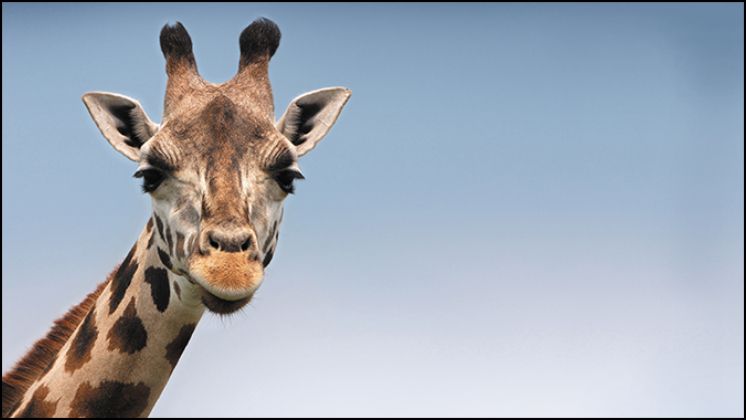
16:9 – One of the most-used aspect ratios on this entire list, 16:9 is the most common aspect ratio for nearly every social media platform. Facebook, Twitter, YouTube, LinkedIn – it’s even the maximum width for vertical-heavy Instagram. If you take a horizontal picture or video with your phone, it’s almost certainly in a 16:9 aspect ratio.
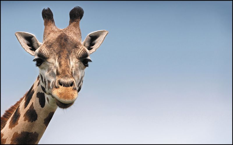
16:10 – This is an odd one, and an aspect that few may be familiar with, but if you use an Apple laptop, your screen uses this unusual aspect ratio. For wallpapers and screensavers, this 16:10 aspect ratio is a good one to remember.
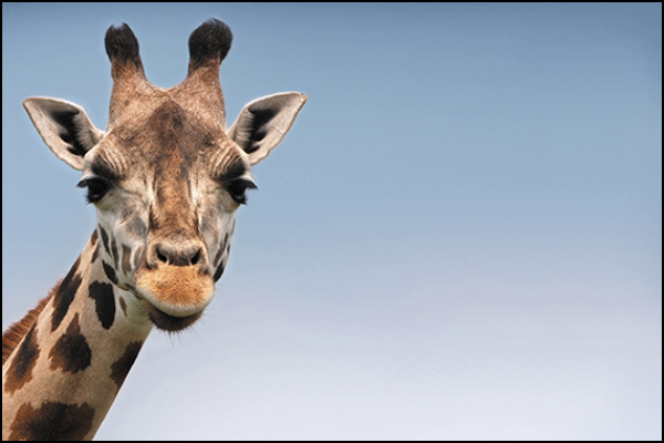
3:2 – As with its vertical counterpart, 3:2 is the default aspect ratio used by photographers. For photos of actual landscapes, this is the most likely aspect ratio to find in professional photography spaces.
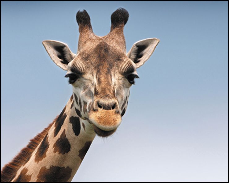
5:4 – Photographs in a landscape orientation are also commonly cropped to a squarer shape when made into prints. In this case, the 3:2 default for photographers is trimmed down to a taller 5:4.
2. Posting on Different Platforms
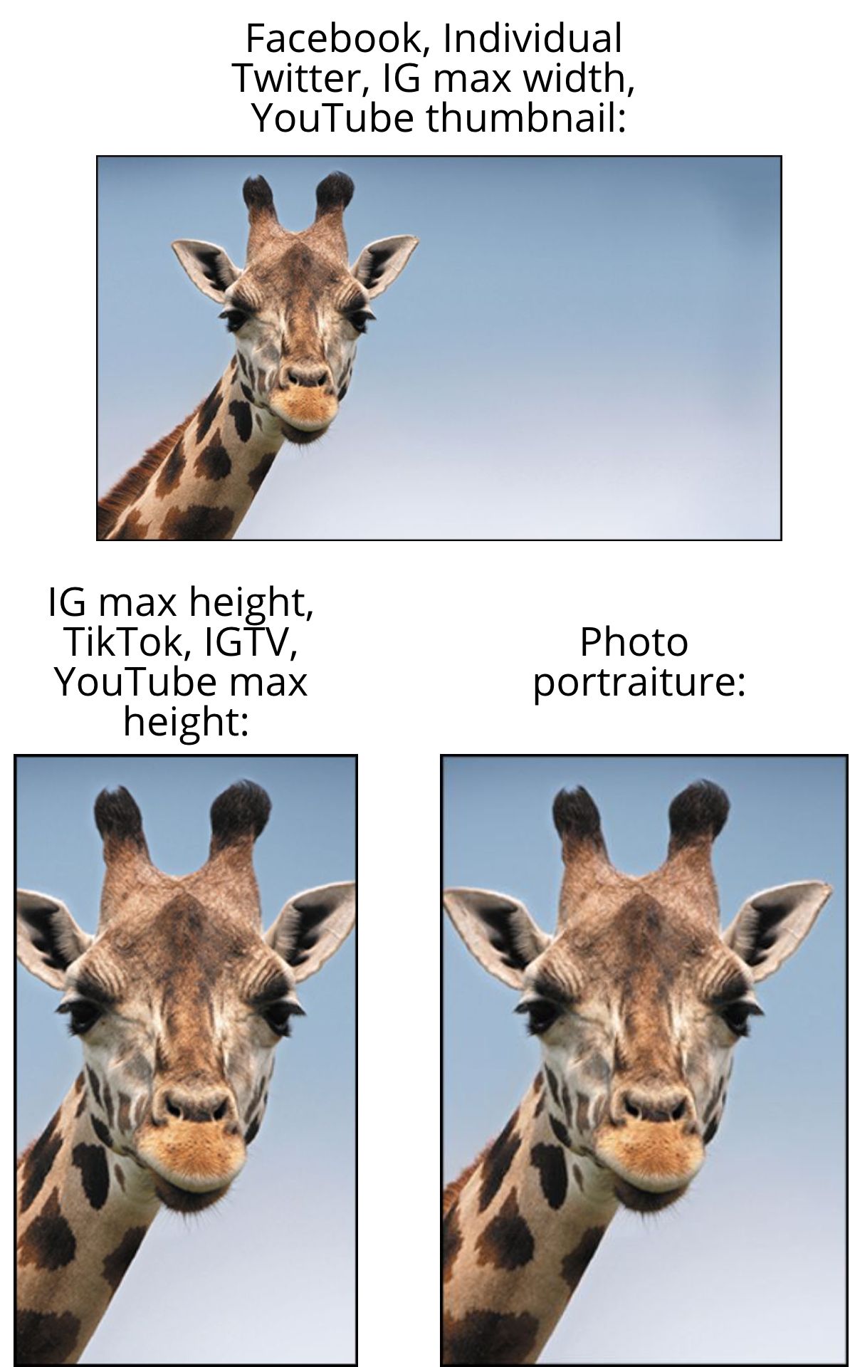
If you’re creating content for digital destinations, the most important thing to consider when deciding whether to use a portrait or landscape orientation is the primary platform where you’ll publish your content. As I mentioned above, your safest option is most likely 16:9, but it may not be your best option.
For video content on Instagram, IGTV, TikTok, and YouTube Shorts, taller videos up to 9:16 are far preferable, taking up more space on screen and fitting mobile interfaces much better. And on platforms like Pinterest or Reddit, even taller images will display at their full height, occupying more real estate on screen and grabbing more attention.
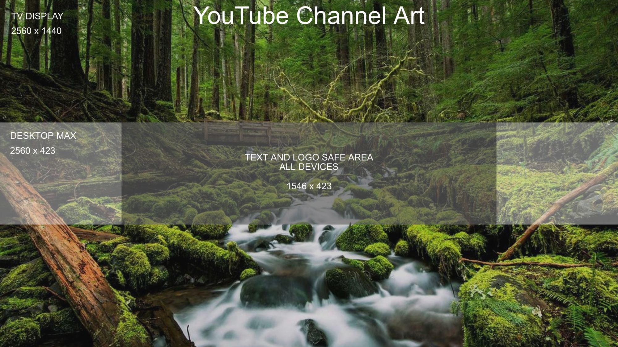
When making decisions about your content’s dimensions, make sure to check out the requirements and recommendations for the places where you intend to share it. These can get a little bit complicated, but you can consult this resource on the most common social media aspect ratios to get started.
3. Showing What You Need
This is probably the most obvious part of deciding which orientation to use for your content: what you’re including in the frame. If you’re shooting photos of specific things, it may be an easy decision. Do you want a lot of the sky in frame? Are you trying to get a good view of a subject’s entire outfit? Portrait is the way to go. Do you need to capture a broad vista or snap an entire group of people? Go horizontal and use a landscape orientation.
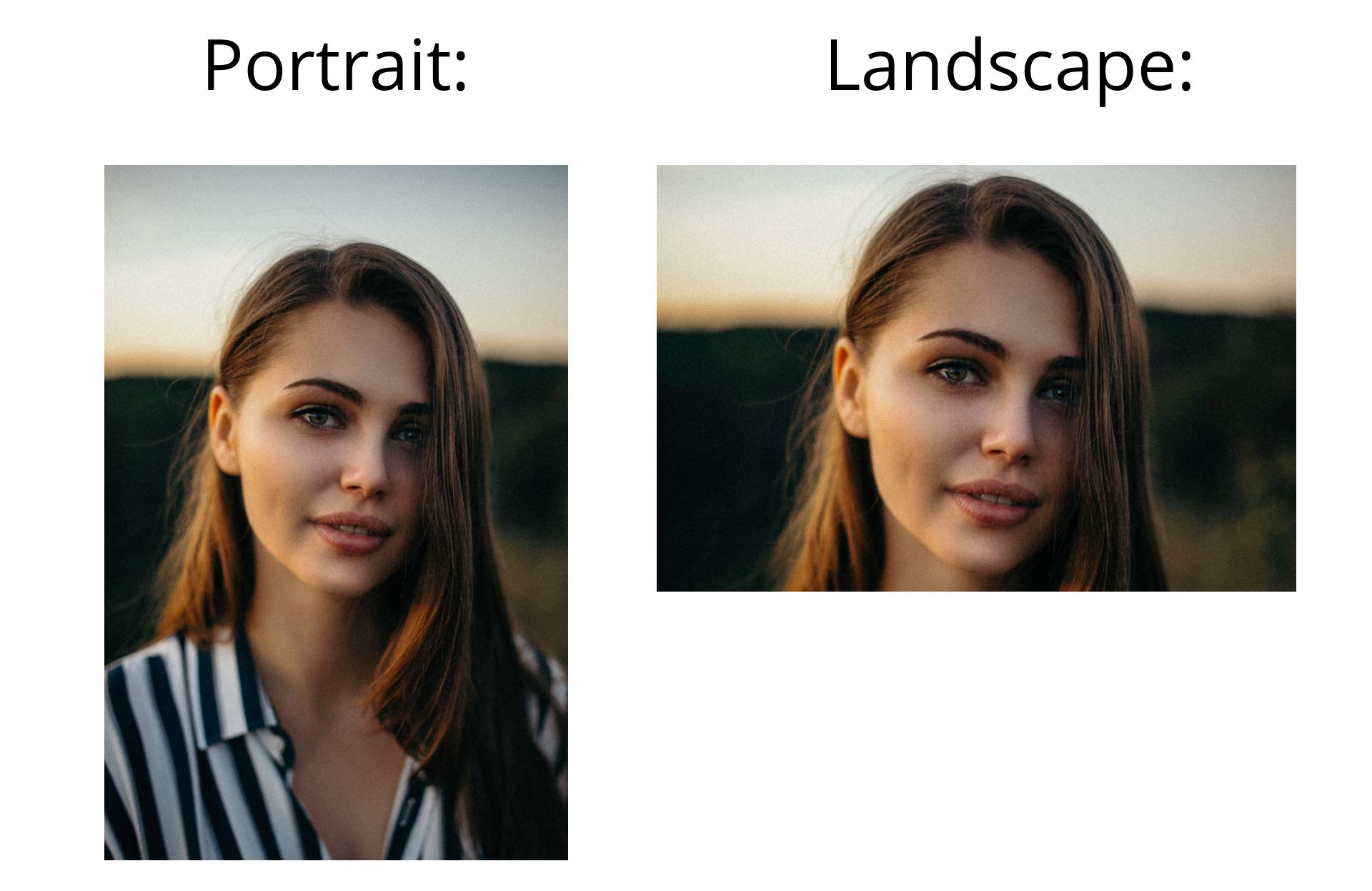
As you can see, even though the subject's face is fully included in both, the portrait orientation clearly presents more substance with less filler. If it’s not quite so obvious which orientation to use for your content, try framing it one way, then the other. Are the words on your flyer easier to scan vertically or horizontally? Is it better to have a bit of extra sky or a bit of extra grass? If you still can’t decide, create your content in various aspect ratios, then decide which result is better for the places you want to share or display it.
4. Using Different Types of Content
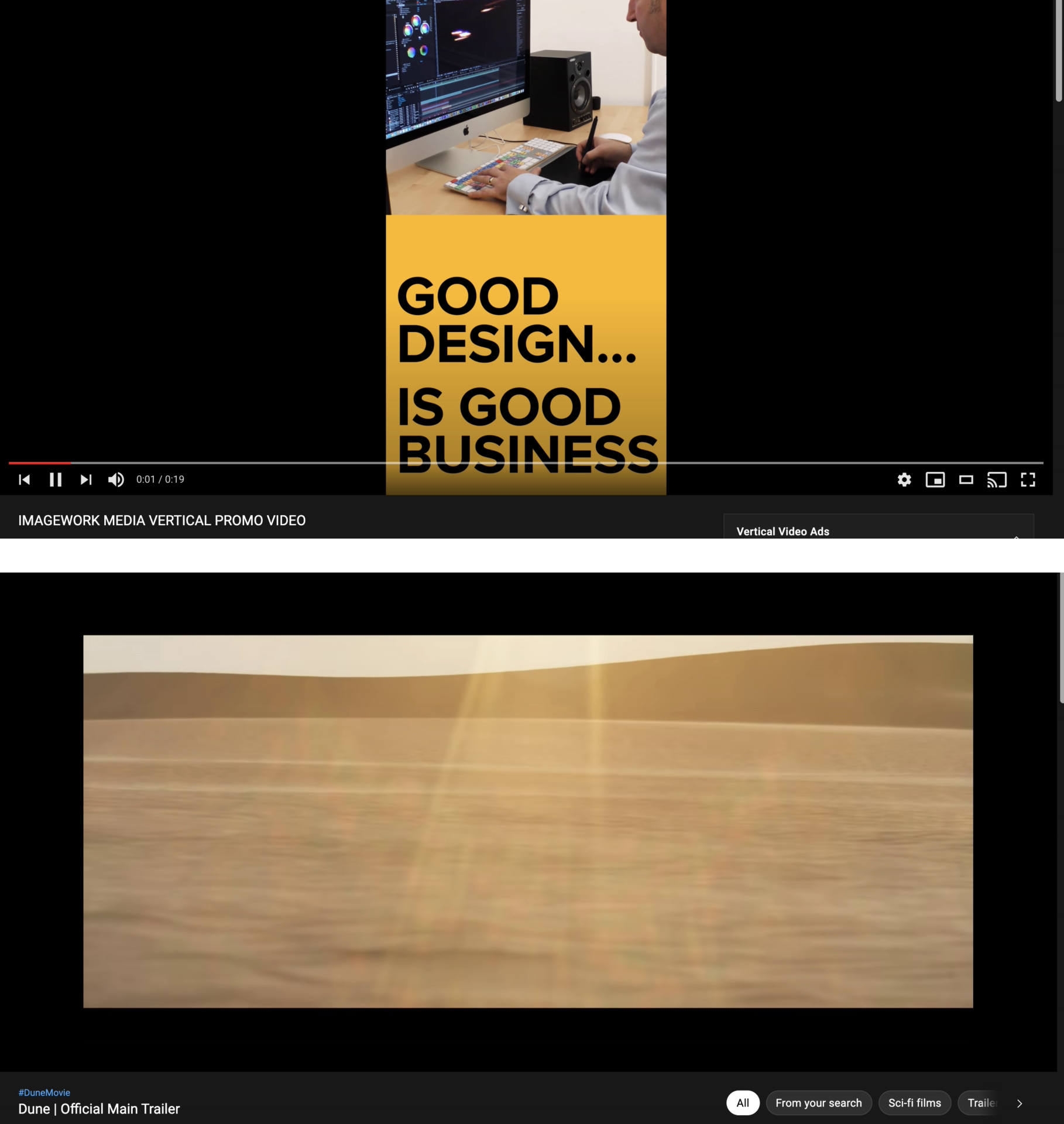
The type of content you’re making may influence the orientation you end up using, as well. If you’re shooting a cinematic project, or want your video to feel a bit like a feature film, you may want to use a cinematic widescreen aspect ratio as wide as 21:9. On the other hand, if you want your video to feel informal and social, you may want to use a 9:16 vertical orientation, even for developed and polished projects. You may have seen this type of content in YouTube ads, where even expensive and professionally-produced videos use a 9:16 aspect ratio for a lighter, more fun atmosphere.
I hope this article helps you choose which visual orientation to use, no matter what your project is. For more tips and tutorials on creating great digital content in 2021, check out the Kapwing YouTube channel, or read through some related articles on formatting photo and video projects:
• How to Fit the Whole Picture on Instagram
• How to Make a Vertical Video Horizontal
• New Twitter Crop Sizes for 2021
• How to Format Images for Squarespace


